DataMed
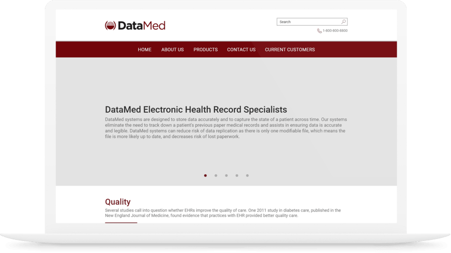
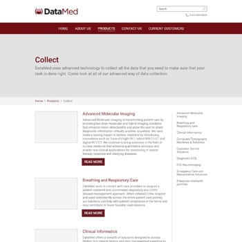
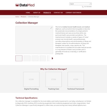
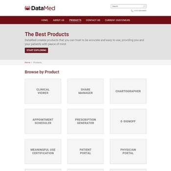
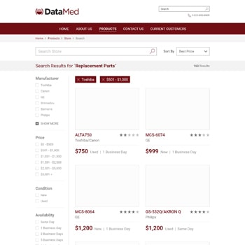
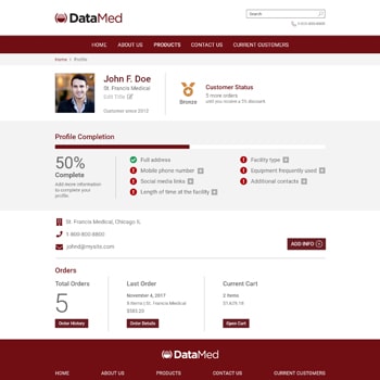
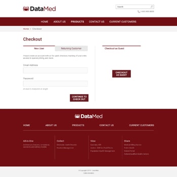
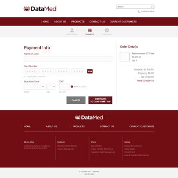
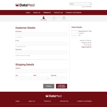
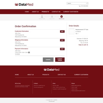
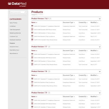
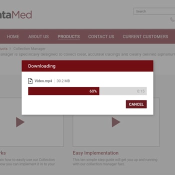
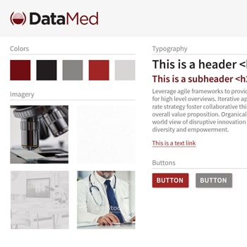
DataMed is a medical technology company that develops software for displaying and sharing electronic medical health records. This project involved creating a new interface design for their website to provide a clearer experience to their clients and users. Wireframes and mockups were developed in Adobe XD to create the structure and look and feel of the new site. A large collection of page designs were created in order to span the breadth of the site.
Home Page
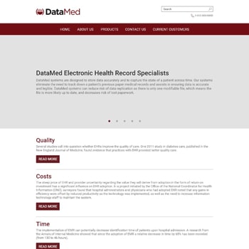
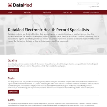
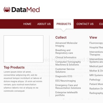
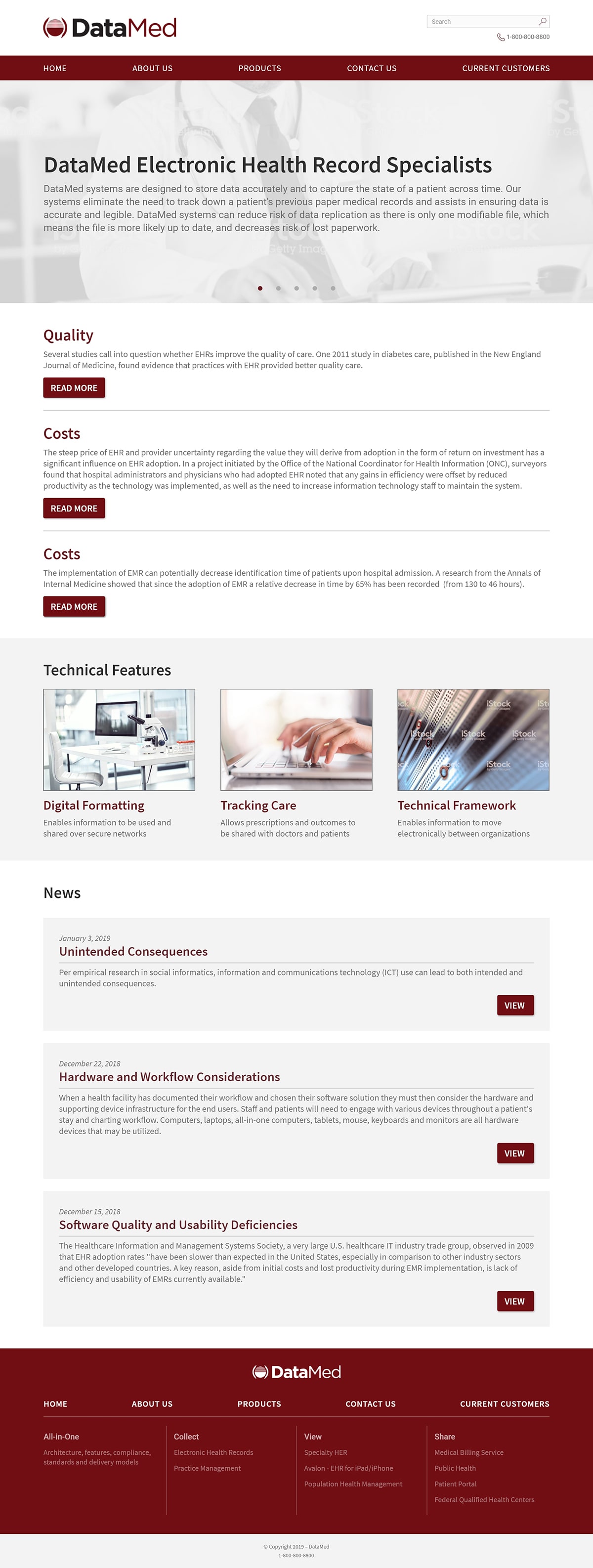
The home page wireframe was developed first to serve as the backbone of the site. The design is bright and modern to invoke the feeling of cleanliness, using the red for DataMed’s logo highlight areas of importance. The top-level navigation was built to give users a clear path to finding anything they might need on the site, with sections that drop down in the form of a well-organized megamenu.
A heavy emphasis was placed on the call to action with a jumbotron slider being the first thing users see in the page content. The rest of the page highlights many areas of the site that a variety of users are likely to access. The fat footer serves the purpose of breaking up all the content links of the site in an organized fashion, so that if a user manages to not find what they are looking for on the page, the footer will solve that issue.
Development
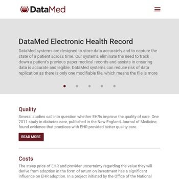
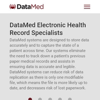
The pages were designed in Adobe XD and made to live in a middle group between mockup and wireframe. They have more color and design choices that you would normally find in a wireframe, but without fully adding all of the design element and images you would find in a mockup. This allowed for a strong focus on the base UI and UX, but without foregoing aesthetics. The focus was aimed at creating a great experience at the desktop view, so all of the pages were created using a 12-column grid at a 1080p resolution (other than the home page, which has tablet and mobile wireframes).
